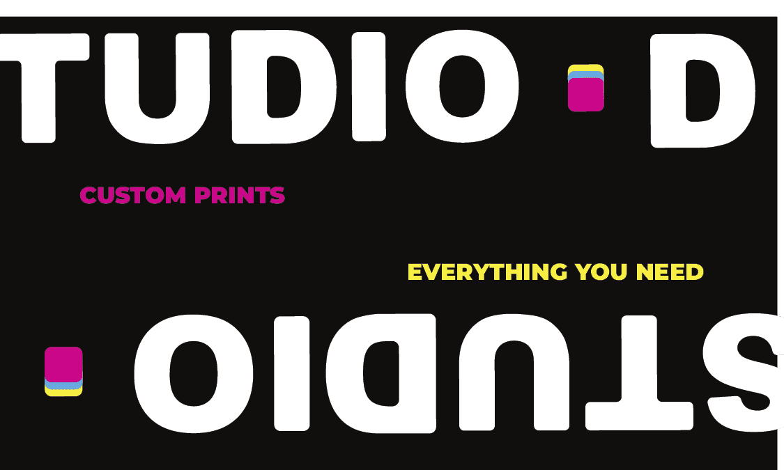
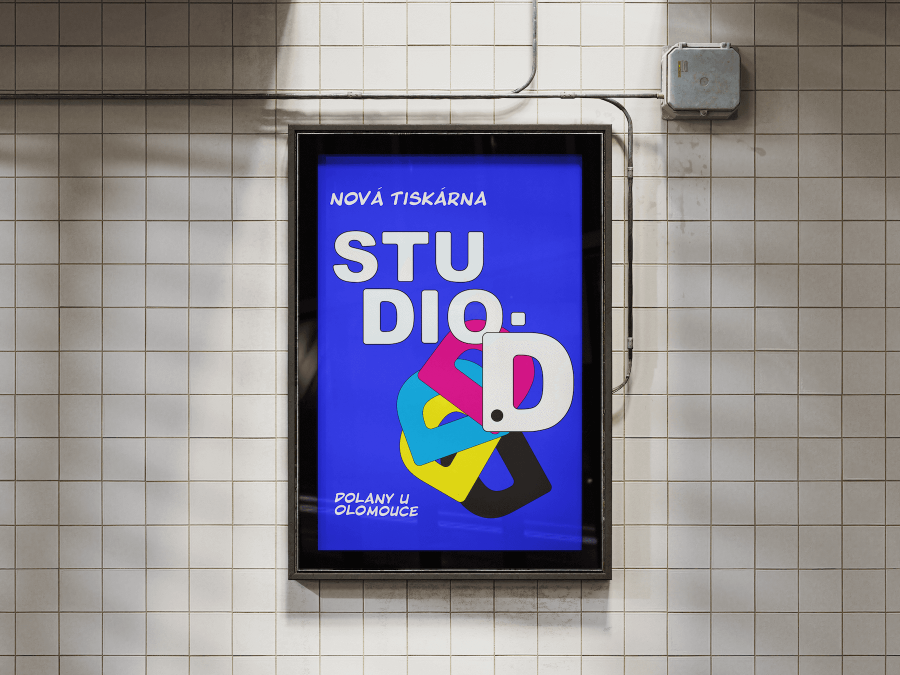
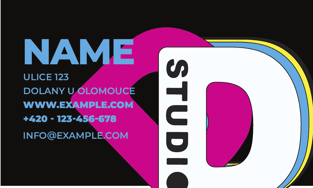
< Back

Studio-D

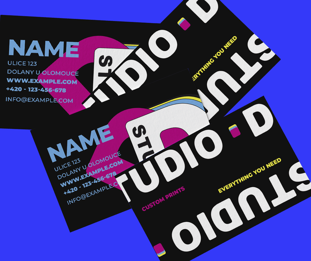
Studio D is a neighborhood print shop with a reputation for high-quality work—and a forgettable brand. They needed an identity system that felt fresh, reliable, and just creative enough to reflect their clientele: artists, small business owners, and detail-obsessed designers.

The challenge was to modernize without over-designing. We didn’t want it to feel like a tech startup or a trendy design studio. Studio D is hands-on. Local. Trustworthy. The new identity reflects that—clean, flexible, and strong enough to print beautifully on anything from a shipping label to a silkscreen poster.

Studio-D logotype variations on a black background with bold colored dots and phrases like ‘custom printing’ and ‘everything you need.’ Showcasing brand flexibility.
Studio-D branding poster mounted on a tiled wall, featuring bold geometric typography in blue, pink, yellow, and white with overlapping shapes. Designed by Seven Twenty One Design.

Brand Concept:

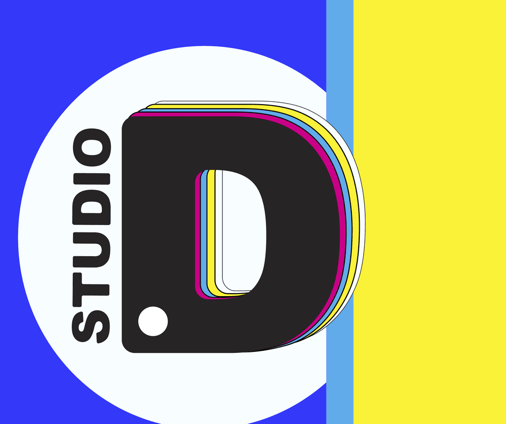
The brand leans on a simple idea: let the work speak, but don’t whisper. Studio D’s new system is anchored in a custom stacked logotype that balances structure with just a bit of play. The identity nods to classic grid systems and printing marks without being overly nostalgic. It’s understated, not invisible.

Strategy Highlights:

Positioning: Reliable but never boring

Audience: Small businesses, local artists, and design professionals

Tone of Voice: Direct, confident, and clear

Design Intent: Print-first flexibility—works in color, grayscale, and at micro sizes

Positioning: Reliable but never boring

Audience: Small businesses, local artists, and design professionals

Tone of Voice: Direct, confident, and clear

Design Intent: Print-first flexibility—works in color, grayscale, and at micro sizes

Strategy Highligths:

Studio-D business card mockup showing contact details in a bold, colorful layout with a large D graphic. Brand identity by Seven Twenty One Design.
Spread of black Studio-D business cards with tilted logotypes and bright accent colors, demonstrating scalable layout system.
Large circular letter D mark in pink, white, and yellow, surrounded by blue and black bars. Represents the standalone symbol for Studio-D.

The Challenge:

Studio D was doing great work, but their branding didn’t show it. The old identity felt generic—more like an afterthought than a reflection of the team behind it. The shop is run by a younger crew who wanted the brand to feel sharp, clean, and current—without leaning into tired design tropes or nostalgic print-shop aesthetics. The challenge was to create a system that felt intentional but low-maintenance, one that could scale easily across all their client touchpoints while still looking professional and relevant.

What I Did:

Developed a modular logo system that feels bold, modern, and efficient

Built a flexible type and layout system designed for speed and clarity

Designed brand assets for packaging, labels, invoices, signage, and more

Introduced a minimal color palette and icon system to reduce visual clutter

Delivered everything in a streamlined brand kit—easy to use, hard to mess up